Notes on Chapter 2 of Forecasting: Principles & Practice
Time series patterns#
Trend: Trend exists when there is a long-term increase or decrease in the data. The meaning of long or short is relative and depends on the data’s time scale. The trend does not need to be monotonic. It might go from an increasing trend to a decreasing one and vice versa. So long as the time scale of the tendency is larger than the data’s time scale, trend can be identified.
For example, Fig. 1 shows the weekly passenger load of Ansett Airlines’ economy class between 1986 and 1993. The data clearly indicates that there is an increasing trend, though bumpy, in the years 1986, 1990, and 1991 that lasted over several months.
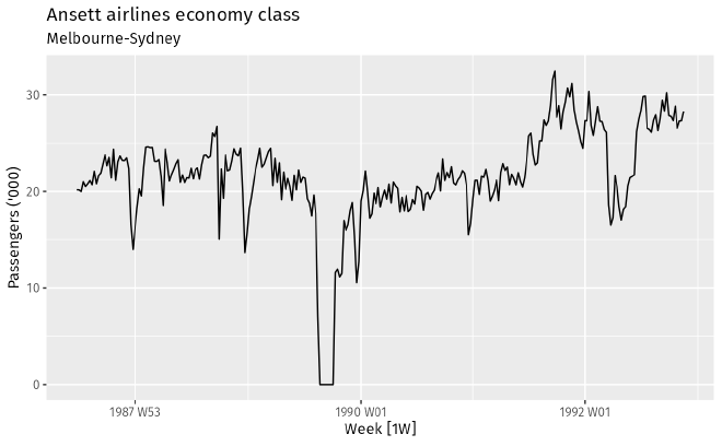
Fig. 1 Weekly economy passenger load on Ansett Airlines. Credit: Forecasting: Principles and Practice Fig. 2 summarizes the monthly sales of antidiabetic drugs in Australia between 1992 and 2008. Clearly, this example demonstrates that the sales is trending upward in this time period.
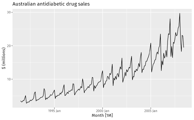
Fig. 2 Monthly sales of antidiabetic drugs in Australia. Credit: Forecasting: Principles and Practice Seasonal: When a time series is affected by seasonal factors such as the time of the year or the day of the week, we say a seasonal pattern exists. Seasonality is always of a fixed and known period. For example, the drug sales data shown in Fig. 2 shows a strong yearly seasonality, and the pattern persists.
Cyclic: A cycle occurs when the data exhibit rises and falls that are not of a fixed frequency. The emphasis on the non-fixed frequency makes it clear that cyclic pattern and seasonality are different concepts. The latter, as Fig. 2 illustrates, has a clear and well-defined period/frequency. The textbook also mentions that in general the length of a cycle is longer than the length of seasonal patterns. For example, Fig. 3 is the Sunspot’s activity between 1920 and 2020. The sunspot number has a roughly 11 year cycle. this period is not tied to any seasonal factor such as daily, weekly, or yearly and is much longer.
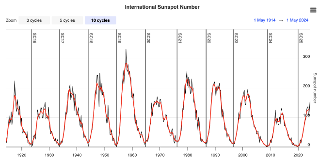
Fig. 3 International Sunspot number. Credit: Forecasting: SpaceWeatherLive.com
Deciphering seasonality through visualization#
Seasonal plots: If the time series data exhibit seasonality, the pattern can be visualized by seasonal plots. These plots are similar to the usual time series plots except that the data are plotted against the individual seasons, such as sub-daily, daily, weekly, monthly, yearly, … etc.
Seasonal subseries plots: This is a plot that emphasizes the seasonal patterns by showing the data in separate mini time series plots. This type of plot is useful in identifying changes within particular seasons.
Scatter plots#
When studying the relationship between two time series (for example: electricity usage and temperature), it is useful to plot one series against the other using the scatter plot.
To further quantify the relationship, one can calculate the correlation coefficient to measure the strength of linear relationship between the two time series (variables). The correlation coefficient is defined as $$ r = \frac{\sum (x_t - \bar{x})(y_t - \bar{y})}{\sqrt{\sum(x_t - \bar{x})^2} \sqrt{\sum(y_t - \bar{y})^2}}. $$ By definition \(-1 \leq r \leq 1\), with \(r=1\) (\(-1\)) being the perfect positive (negative) correlation.
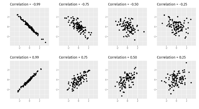
Note that \(r\) only measures the strength of linear correlation between two variables. It cannot quantify higher order or more complex correlations. Therefore, one should not rely solely on correlation coefficients when looking at the relationship between variables.
Lag plots#
A lag plot is a useful quick visualization illustrating correlations between different time differences.
To be more specific, is a correlation scatter plot between \(y_t\) and \(y_{t-k}\) for different values of \(k\).
For example, the following lag plots are showing correlation of the beer production data for lags \(k=1\) to 9.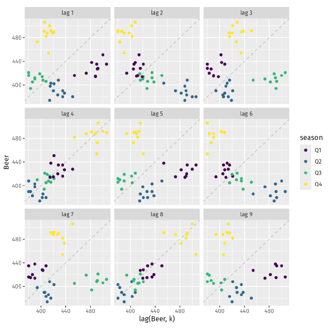
Autocorrelation#
Lag plots are useful visual aids for investigating time series correlations. Each panel summarizes the correlation between lagged values \(k\) of a time series. Autocorrelation is a plot that summarizes these correlation coefficients. For example, \(r_1\) measures the relationship between \(y_t\) and \(y_{t-1}\), \(r_2\) measures the relationship between \(y_t\) and \(y_{t-2}\), \(\ldots\). In general, \(r_k\) is defined as $$ r = \dfrac{\displaystyle\sum_{t=k+1}^T (y_t - \bar{y})(y_{t-k} - \bar{y})} {\displaystyle\sum_{t=1}^T (y_t - \bar{y})^2}, $$ where \(T\) is the length of the time series. This is very close to the correlation coefficient formula introduced above except that the denominator is the time series value at the same point of time \(t\), hence the name autocorrelation.
The autocorrelation coefficients make up the autocorrelation function (ACF). Correlogram is a visualization of ACF
that shows lag value \(k\) versus \(r_k\). Below is an ACF of the beer production time series. It is very clear
from the graph that there is strong positive correlation on lag 4, 8, 12, and 16; while anti-correlation is observed
for lag 2, 6, 10, 14. This conclusion is consistent with the lag plots shown earlier, as it should be. But ACF is
a more convenient approach for investigating time series autocorrelations. Note that in the correlogram, the dashed
blue lines indicate whether the correlations are significantly different from zero.
Trend and seasonality in ACF#
When data have a trend, the autocorrelations for small lags tend to be large and positive because observations nearby in time are also close in value. As a retule, the ACF of a trended time series is expected to have positive values that slowly decrease as the lags increase.
When data are seasonal, the autocorrelations will be larger for the seasonal lags (at multiples of the seasonal period) than for other lags, as the correlogram of the beer production indicates.
If data have both a trend and are seasonal, the combination of both effects is expected. That is, a slow decrease in the ACF as the lags increase due to the trend, while the “scalloped” shape is due to the seasonality.
White noise#
Time series that show no autocorrelation are called white noise. The figure below illustrates a white noise time series along with its ACF. The ACF indicates that all lags are statistically insignificant, i.e. there is no autocorrelation in the time series.

